This is the early access documentation preview for Custom Views. This documentation might not be in sync with our official documentation.
Schemas
A schema is a JSON file that specifies what a user of the Studio can configure.
A schema determines what and of what type the fields are for the configuration of some features from the Studio. For example, a Frontend component schema determines the fields that Studio users can set to configure the content and appearance of a Frontend component, such as a toggle to show the component on mobile or a text field to enter the label of a button.
You can create a schema for the following features:
Structure of a schema JSON file
A schema is a JSON file with the following required properties:
A key that defines the type of the schema. The key must be one of the following:
tasticType: for Frontend components.customDataSourceType: for data sources.dynamicPageType: for dynamic pages.
The value for this key is the unique identifier of the schema. The unique identifier is referenced in both the code and the Studio, so it must be readable. We recommend following a naming convention such as
<project>/<identifier>, for example,demo/products-list.name: string. The name of the schema displayed in the Studio. We recommend choosing a name that Studio users can understand.category: string. The name of the category used to group the schemas in the Studio. For example, all data source schemas with this field set toContentwill be grouped in the Studio in the Content category section.icon: string. The name of the icon displayed in the Studio. For example, of the icon displayed next to a data source schema name. You can choose any icon from Material icons.schema: array of objects. It determines the configuration sections and the related fields. For further information, see Schema.
The following is an example of a schema with the key set to customDataSourceType only for demonstration purposes.
{"customDataSourceType": "demo/example","name": "Example schema","category": "Examples","icon": "info","schema": [{"name": "Content API configuration","fields": [{"label": "Enter Content ID","field": "contentID","type": "string"}]}]// Other schema properties.}
Schema
schema is an array of objects displayed as sections in the Studio, each containing the following required properties:
name: string. The configuration section name displayed in the Studio.fields: array of objects. It determines the fields available to the Studio users to manage a configuration.
In the fields array, each object contains the following properties:
label: string - required. The field label displayed in the Studio.field: string - required. The unique name of the field used to access the value from the resulting data object.The schema sections are only used in the Studio and the resulting configuration is flattened before passing to the API hub or the Frontend components. Therefore, you must ensure all field names are unique.
type: string - required. The schema field type displayed in the Studio.translatable: boolean - optional. It determines if the field value can be available in different languages. For more information, see Internationalization and using multiple languages for a field on the locales and translations.required: boolean - optional. It determines if the field is required and therefore Studio users must set it.You still need to check if the field value is set in your Frontend component code because it might not be loaded yet (asynchronous) or the Studio user ignored the warning about a required field (for example, to store a draft).
default: string - optional. The default value you want to receive when the configuration is left empty in the Studio. The default isnull.values: array - optional. Key-value pairs to define the values ofenumfields.
Schema field types
The commercetools Frontend schemas support the following field types.
Boolean
The boolean field type lets Studio users use a toggle to set the field value to true or false. This field is not translatable.
{"name": "Width settings","fields": [{"label": "Show the content full width","field": "isFullWidth","type": "boolean"}]// Other schema properties.}
Data source
The dataSource field type lets you specify a data source for your Frontend components.
The dataSource field type must have a dataSourceType property set to the unique data source identifier specified when creating the custom data source schema.
{"name": "Data sources","fields": [{"label": "Product selection data source","field": "productList","type": "dataSource","dataSourceType": "myShop/product-list","default": null}]// Other schema properties.}
Encrypted
The encrypted field type lets you safely store secret information like your API credentials. The API hub stores the value after encrypting it and decrypts it when read from the backend extensions.
Encryption is a compute heavy task. Only use encrypted fields for secret credentials. Overusing encrypted fields can slow down your application.
{// Other schema properties."fields": [{"label": "Enter the secret variable","field": "SECRET_VARIABLE_NAME","type": "encrypted","translatable": false,"required": true}]// Other schema properties.}
Enum
The enum field type lets Studio users select an option from a drop-down. The enum field type requires a values property that's an array of objects, each with a name and value pair. The name is displayed as the drop-down item text in the Studio, and the value is used in the Frontend component or API hub. This field is not translatable.
{// Other schema properties."fields": [{"label": "Theme","field": "theme","type": "enum","required": false,"values": [{"value": "dark","name": "dark"},{"value": "light","name": "light"}],"default": "dark"}]// Other schema properties.}
Group
The group field type lets you bundle a set of input fields of different types. For example, to create tiles with product images, it could be necessary to upload an image, enter the name of the image, and add a link. You can bundle the image, the name, and link fields in the same group.
In your group fields, we recommend using the itemLabelField property and the related name field to activate the insertion and display of group names in the Component settings pane of the Studio's page builder. This helps Studio users to identify groups while working in the page builder.
For example, let's say you develop a Frontend component that lets Studio users create image tiles. The Frontend component contains the Tiles schema, which contains the Tile group, which then contains the input fields to configure the tile settings (for example, image).
In such a case, you could use the itemLabelField property so that Studio users can set and see the name of tiles while working in the page builder. In the following example, the itemLabelField property specifies that the name field is used to display the tile group name.
Within a group field, you can also use the min and max properties to set the minimum and maximum numbers of groups that Studio users can create. For example, if you want Studio users to add at least one but up to six image tiles, as in the following example.
{// Other schema properties."schema": [{"name": "Tiles","fields": [{"label": "Tile","type": "group","min": 1,"max": 6,"itemLabelField": "name","field": "tiles","fields": [{"label": "Tile name","field": "name","type": "string","required": true},{"label": "Image","field": "image","type": "media","required": true}//...]}]}]// Other schema properties.}
When creating a tile, Studio users could set its name using the Tile name field.
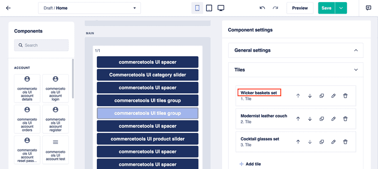
The tile names set by Studio users would then appear in the Tiles section of the Components settings pane.
Instant
The instant field type lets Studio users select a date and time. This field is not translatable.
The selected date and time are based on the time on the computer of Studio users.
{// Other schema properties."fields": [{"label": "Countdown to","field": "countdownTo","type": "instant","default": "Fri Jul 15 2024 16:14:00 GMT+02"}]// Other schema properties.}
JSON
The json field type lets Studio users enter text in JSON format.
{// Other schema properties."fields": [{"label": "Teaser JSON","field": "teaserJson","type": "json","default": null}]// Other schema properties.}
Markdown
The markdown field type lets Studio users enter Markdown text in the Markdown editor. By default, this field is translatable based on the locales configured for your project.
{// Other schema properties."fields": [{"label": "Content","field": "text","type": "markdown","default": "* Enter\n* some\n* Markdown","translatable": true}]// Other schema properties.}
Media
The media field type lets Studio users select an image from the media library and configure additional settings such as an alt text, crop ratio, and gravity-specific cropping. This field is not translatable.
{// Other schema properties."fields": [{"label": "Image","field": "image","type": "media","required": true}]// Other schema properties.}
Node
The node field type lets Studio users select a page folder from the page folder drop-down in the site builder and return the corresponding page folder ID. This field is not translatable.
{// Other schema properties."fields": [{"label": "Node","field": "node","type": "node","required": false,"default": null}]// Other schema properties.}
Number, Integer, and Decimal
The number, integer, and decimal field types let Studio users enter a numeric value. This field is not translatable.
{// Other schema properties."fields": [{"label": "Space in px (Overrides Size field)","field": "spaceInPx","type": "integer","default": 0}]// Other schema properties.}
Reference
The reference field type lets Studio users select a page folder or enter an external URL. This field is not translatable. For more information, see Working with links.
{// Other schema properties."fields": [{"label": "Link","field": "reference","type": "reference","required": false,"default": null}]// Other schema properties.}
String
The string field type lets Studio users enter one-line text. By default, this field is translatable based on the locales configured for your project.
{// Other schema properties."fields": [{"label": "Headline","field": "label","type": "string"}]// Other schema properties.}
Text
The text field type lets Studio users enter multi-line text. By default, this field is translatable based on the locales configured for your project.
{// Other schema properties."fields": [{"label": "Teaser text","field": "teaserText","type": "text","default": null}]// Other schema properties.}
Tree
The tree field type lets Studio users select a page folder sub-tree starting from the selected page folder that a Frontend component receives. The page folder sub-tree is useful to render the navigation. This field is not translatable.
{// Other schema properties."fields": [{"label": "Navigation tree","field": "tree","type": "tree"}]// Other schema properties.}
Additional information field types
To provide the Studio users with information about a schema, you can add the description and image field types. These fields are shown at the top of a schema settings section in the Studio. These fields are for display only and do not collect any user input.
Description
The description field type lets you display a text on the schema settings section.
{"schema": [{"fields": [{"type": "description","text": "Enter the credentials for your commercetools Frontend project."}]}]// Other schema properties.}
Image
The image field type lets you display an image on the schema settings section.
{"schema": [{"fields": [{"type": "image","url": "https://commercetools.com/_build/images/logos/commercetools-logo-desktop.svg"}]}]// Other schema properties.}
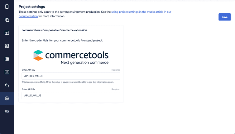
For example, the following schema definition with a description field renders as shown in the image.
{"schema": [{"name": "Project credentials","fields": [{"type": "description","text": "Enter the credentials for your commercetools Frontend project."},{"type": "image","url": "https://commercetools.com/_build/images/logos/commercetools-logo-desktop.svg"},{"label": "Enter API key","field": "API_KEY","type": "encrypted","required": true},{"label": "Enter APP ID","field": "APP_ID","type": "string","required": true}]}]}


