This is the early access documentation preview for Custom Views. This documentation might not be in sync with our official documentation.
Using the page builder
From the page builder you can define the layout of page versions.
Access the page builder
You can access the page builder by editing a page version from the following Studio areas:
Page builder interface
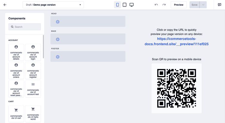
The page builder interface consists of four parts:
- The menu bar at the top
- The components pane on the left
- The layout section in the middle
- The preview section on the right
Components pane
The pane displays the Frontend components that you can add to the layout section to design the page version. In the pane, Frontend components are grouped by category for easier access. You can also search for a Frontend component by entering its name in the search box.
Layout section
The layout section is divided into the HEAD, MAIN, and FOOTER sections. From here you can create the structure of the page version by adding layout elements, component groups, and Frontend components.
Layout elements are the containers for Frontend components, they have predefined breakpoints for different devices: mobile, tablet, and desktop. The following table shows how the layout element is displayed on each device.
| Layout element | Mobile | Tablet | Desktop |
|---|---|---|---|
| 1/1 | 1/1 | 1/1 | 1/1 |
| 1/2 | 1/1 | 1/2 | 1/2 |
| 1/3 | 1/1 | 1/2 | 1/3 |
| 2/3 | 1/1 | 1/2 | 2/3 |
| 1/4 | 1/1 | 1/2 | 1/4 |
| 1/6 | 1/2 | 1/6 | 1/6 |
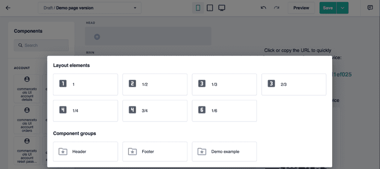
Add a layout element or a component group
To add a layout element or a component group, click Add layout element in the respective section and select the layout element or component group from the dialog.
Edit a layout element
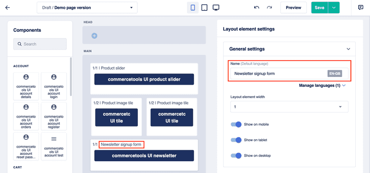
To edit a layout element, select the layout element in the layout section. Then, in the Component settings pane, set the configuration values in the General settings section:
In the Name field, enter the name to be displayed on the layout element in the layout section, it helps identifying the layout element.
From the Layout element width drop-down, select the width of the layout element.
Set the layout element visibility by clicking the following toggles:
- Show on mobile: makes the layout element visible on mobile devices.
- Show on tablet: makes the layout element visible on tablets.
- Show on desktop: makes the layout element visible on desktop devices.
Reorder a layout element
To reorder a layout element, drag it to the new location.
Duplicate or delete a layout element
To duplicate or delete a layout element, hold the pointer over it, click More, and select Duplicate or Delete.
Add a component
To add a Frontend component, you first need to add the layout element to contain the component if it is not present. Then, select the component from the Components pane and drag it to the layout element.
Edit a component
To edit a Frontend component, follow these steps:
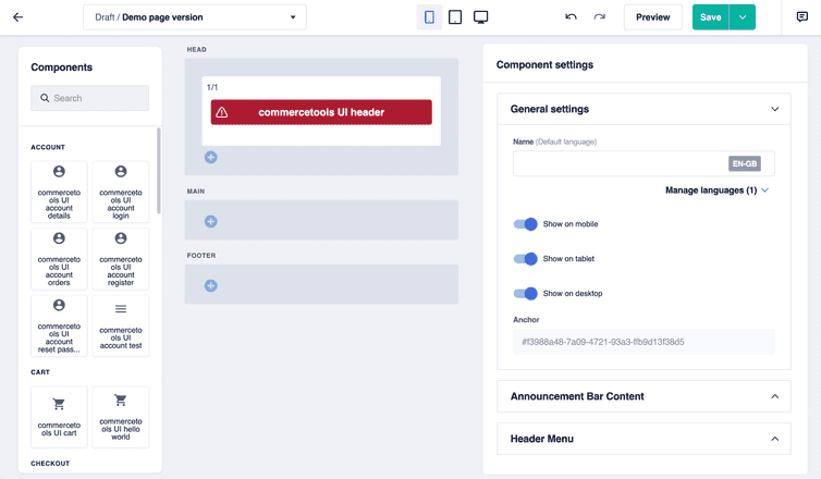
Select the component in the layout section. Then, in the Component settings pane, set the configuration values in the General settings section:
In the Name field, enter the name to be displayed on the component in the layout section, it helps identifying the component.
Set the component visibility by clicking the following toggles:
- Show on mobile: makes the component visible on mobile devices.
- Show on tablet: makes the component visible on tablets.
- Show on desktop: makes the component visible on desktop devices.
Frontend components are fetched on the client side, even when they are hidden for the type of device in use. Components are included in the DOM, but the hidden ones are not rendered on the screen. Hiding DOM elements using CSS is a common approach to create responsive websites and the hidden DOM elements don't affect your website's performance.
Set the configuration values in the other sections that vary depending on the selected component's schema.
For information on the configuration fields of Frontend components, see Component settings.
Reorder a component
To reorder a Frontend component, drag it within the same layout element or to another layout element.
Duplicate or delete a component
To duplicate or delete a Frontend component, hold the pointer over it, click More, and select Duplicate or Delete.
Preview section
The preview section displays the page version's preview URL and QR code. The QR code is useful when previewing your page version on a mobile device. You can also access the preview link and QR code from the menu bar.
The page version's preview is not related to the device you selected from the device drop-down in the menu bar, but it is related to the device you are viewing it on. For example, if you selected desktop from the device drop-down but you are displaying the preview on a mobile device, the preview will display the page version for mobile devices.
You can work from the page builder with the preview open, the changes will be reflected instantly on the preview. When you click on a Frontend component from the page builder, the component is highlighted on the preview.


