This is the early access documentation preview for Custom Views. This documentation might not be in sync with our official documentation.
Component settings
Learn about configurable field types for Frontend components.
Each Frontend component has a schema created by developers that determines its structure and the fields to configure it from the page builder. Following is a description of the field types you can find when editing a Frontend component's settings.
Text
Text fields let you enter either one-line text or multi-line text. To edit the text, click the field and enter your text.
The language label indicates for which project language the text will be displayed. If more than one language is set for your project and the field is set to translatable in the schema, multiple text fields are displayed. For more information, see Locales and translations.
Markdown
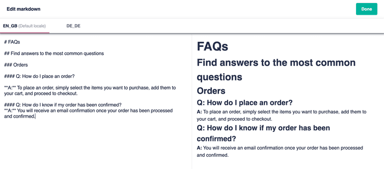
Markdown fields let you enter text with Markdown syntax. To open the Markdown editor, click the Edit icon next to the Markdown field.
In the Markdown editor, you can enter your text in the left pane and see a preview in the right pane. If more than one language is set for your project, you can enter the text for the different languages. To save your changes, click Done, the Markdown editor closes and you will return to the page builder.
Changes in the Markdown editor do not save automatically, remember to click Done to save.
Toggle
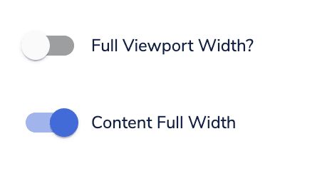
Toggle fields let you activate or deactivate the related setting. The setting is active when the toggle is on the right and inactive when it is on the left.
Drop-down
Drop-down fields let you choose between the available options.
Image
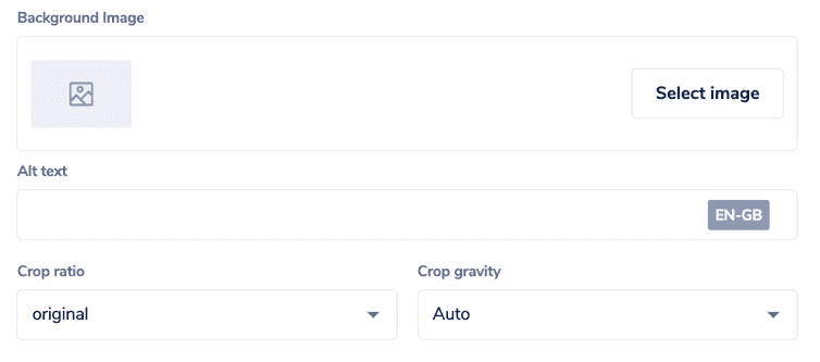
Image fields let you add images to a Frontend component. To add an image, click Select image and select an image available in your project or upload a new one by clicking Add media.
In the Alt text field, you can enter the alternative text associated with your image.
From the Crop ratio and Crop gravity drop-downs, you can select the cropping settings for the image.
To edit or delete an image in the component, click the Edit or Delete icon.
Deleting an image from a component that is used on a live page version will cause errors on your website.
Link
Link fields let you create links of two types: Link or Page folder.
If you select Link, you can add both internal links within your website and external links:
- To add an internal link, you must enter the path to the page (for example,
/new-arrivals). - To add an external link, you must enter the absolute URL (for example,
https://www.example.com).
If you select Page folder, you can choose a page folder to link to from the ones available in your project.
Group
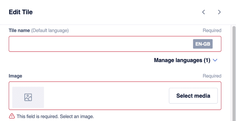
Group fields are sets of fields of different types which are used to create an element of the UI. For example, to create tiles with product images, it could be necessary to enter the tile name, upload a product image, add a link, and configure other settings. In such case, it is possible to bundle the configuration fields in the same group.
You can duplicate, edit, and add a group. You'll see a warning on the group if some required information is missing.
To learn more about group fields, see Group field type.
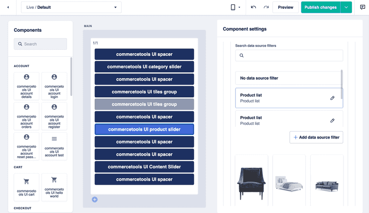
Data source filters
Data source filters lets you to select the data sources from which to retrieve data to display through the Frontend component.
You can create a new data source filter or select an existing one. When creating a filter, you should give it a descriptive name so that you can easily find it again in the future.
You can preview the data retrieved from the data source according to the filters you set, without having to check the preview of the entire page. To display the data source preview, you must add preview data for the Studio.
To learn more about data source configuration, see Developing a data source extension and Schemas.

