This is the early access documentation preview for Custom Views. This documentation might not be in sync with our official documentation.
Creating a configurable Frontend component
Prerequisites
- GitHub customer repository access
- Studio access
- CLI running
- You've read the creating a Frontend component article
In the Frontend component schema, you can provide a schema that makes the Studio render a configuration interface for your Frontend component whenever it's used on a page. The resulting configuration is delivered to the mounted React component of the Frontend component as the prop data.
Schema sections and fields
The schema array of the Frontend component schema allows you to group configuration fields into logical (and in the Studio visual) sections. Each section can contain any number of configuration fields:
{"tasticType": "example/hello-world","name": "Hello World","category": "Example","description": "A very basic frontend component example","schema": [{"name": "Content configuration","fields": [{"label": "Greeting recipient","field": "recipient","type": "string","default": "world"}]}]}
In this example, the schema of the HelloWorldTastic received a section Content configuration which contains exactly 1 configuration field: recipient. The field is of type string and labeled with the text Greeting recipient. If there's no value provided for the field in the Studio, the string world is submitted to the Frontend component as the default for recipient.
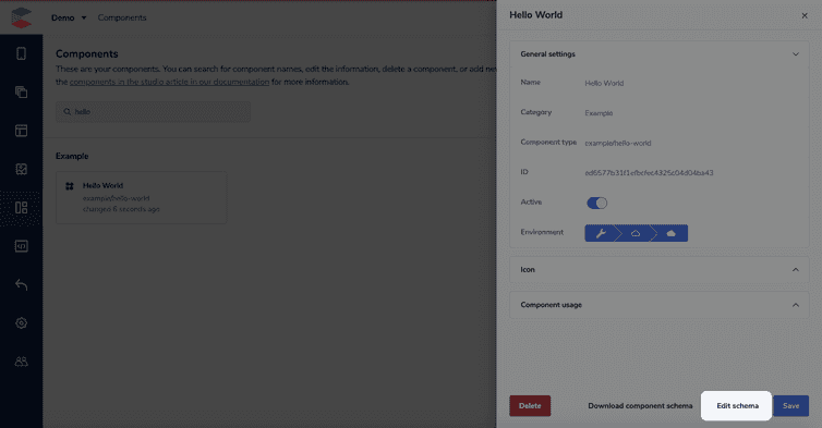
To update your schema, click the name of your component in the Components area, then click Edit schema. This will open the schema editor again, and you can paste the JSON into the editor.
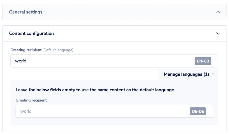
You'll see the below configuration settings when you Validate and preview your schema. This is what will be editable when the component is added to a page version:
The Studio will ask you if you want to override the previous tutorial version. You can do this safely because the schema is backward compatible as a default is provided for the newly added field.
As can be seen, a field of type string is translatable by default. So, if your project is configured to support multiple locales, translation facilities are automatically included in the configuration.
Find out more about schemas and a complete list of field types and their possibilities in schemas.
Component input in code
In the React entry point of your Frontend component, API hub automatically provides you with the prop data which contains the entire configuration from the Studio.
import React from 'react';type HelloWorldTasticProps = {data: {recipient: string;};};const HelloWorldTastic: React.FC<HelloWorldTasticProps> = ({ data }) => {return <h1>Hello {data.recipient}</h1>;};export default HelloWorldTastic;
The updated index.tsx defines a type for the data prop derived from the Frontend component schema. In the code, the provided data can then directly be accessed. As you can see, the component automatically selects the correct localized version of the translatable configuration for you.
Frontend component schema is only for visualization purposes. The field identifiers in different sections are all global. That means you can freely regroup fields into sections, but also that field identifiers must be unique across all sections!

