This is the early access documentation preview for Custom Views. This documentation might not be in sync with our official documentation.
Creating a full viewport component
You can create a Frontend component that takes up the full viewport of a browser (also known as full-bleed). Let's look at an example of how to do this.
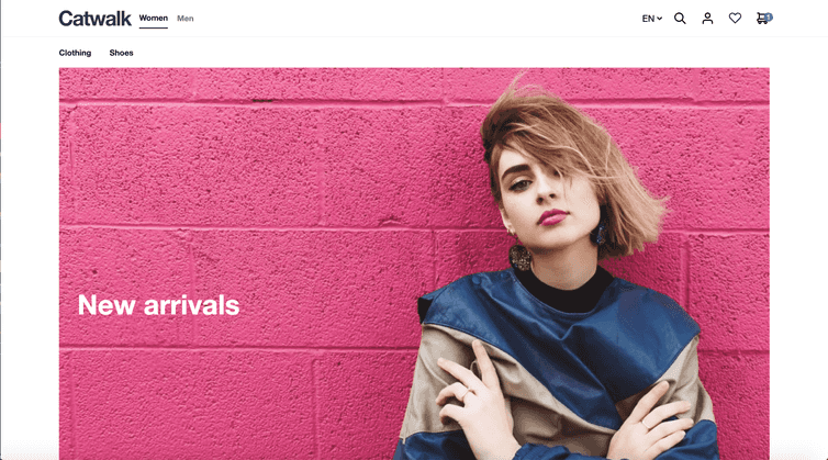
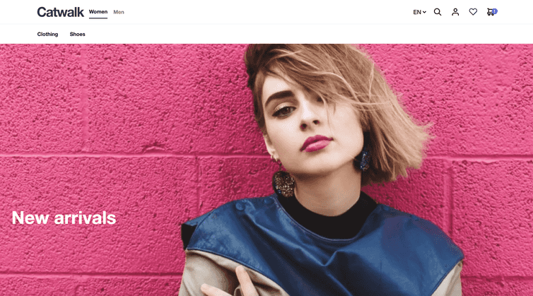
Below is an example of a hero Frontend component. The image can either be the full width of the grid or the full width of the viewport.
| Full width of grid (12-column layout element) | Full width of viewport (full-bleed) |
|---|---|

|

|
Building a full-width component
As always, we start with the schema. We'll create a text field and a toggle so users of the Studio can turn our full-bleed image feature on and off.
{"tasticType": "frontastic/examples/hero","name": "Hero","icon": "image","category": "content","schema": [{"name": "Content","fields": [{"label": "Image","field": "image","type": "media"},{"label": "Full-bleed?","field": "isFullBleed","type": "boolean","required": true,"default": true},{"label": "Aspect ratio","field": "aspect","type": "enum","default": "16/9","values": [{"value": "original","name": "Original"},{"value": "16/9","name": "16:9"},{"value": "4/3","name": "4:3"},{"value": "21/9","name": "21:9"}]}]}]}
Upload this schema to the Studio.
Next, we need to create our index.tsx file to receive the information from the schema.
import React from 'react';import Hero from 'components/Hero';const HeroTastic = ({ data }) => {return <Hero {...data} />;};export default HeroTastic;
Then, we create a wrapper component and add it to our layout folder. This simple React Component makes sure its contents (the children) fill up the whole horizontal viewport space. To accomplish this, we use a little CSS trick.
import React from 'react';export default function FullPageWidthWrapper({ children, className = '' }) {return (<divclassName={className}style={{width: '100vw',position: 'relative',left: '50%',right: '50%',marginLeft: '-50vw',marginRight: '-50vw',}}>{children}</div>);}
We can now use the wrapper to wrap the contents of our component if the users of the Studio choose to do so using the toggle. We do this in the index.tsx of the component.
import React from 'react'import Image from 'frontastic/lib/image';import FullPageWidthWrapper from '../Layout/FullPageWidthWrapper'const Hero = ({ image, aspect, isFullBleed }) => {const aspectClass = {'original': '','16/9': 'pb-16/9','4/3': 'pb-4/3','21/9': 'pb-21/9',}const calculateAspectStyle = (aspect, img) => {if (aspect === 'original' && img) {return { paddingBottom: '${(img.media.height / img.media.width) * 100}%'}}return {}}const content = (<div className={'relative ${aspectClass[aspect]}'} style={{...calculateAspectStyle(aspect, image)}}><Image media={image} className={'w-${isFullBleed ? 'full' : 'auto'} absolute'} alt="Logo" /></div>)if (isFullBleed) {return <FullPageWidthWrapper>{content}</FullPageWidthWrapper>}return content}export default Hero
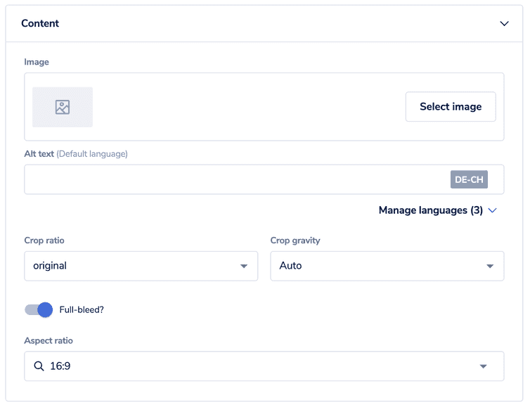
And that's it. When this component is added to a page version in the Studio, you can now select the image and if it's full-bleed or not:
If you add another Frontend component to the same layout element, it could cause your layout to break. Either keep it in a separate layout element or update your CSS to stop this from happening.
