This is the early access documentation preview for Custom Views. This documentation might not be in sync with our official documentation.
Creating Frontend component with a data source
Prerequisites
- GitHub customer repository access
- Studio access
- CLI running
- You've read the creating a Frontend component article, the creating a configurable Frontend component article, and the developing a data source extension article
As mentioned in the creating a configurable Frontend component article, you can create a schema that makes the Studio render a configuration interface for your Frontend component whenever it's used on a page. The resulting configuration is delivered to the mounted React component of the Frontend component as the prop data.
You can create a Frontend component to utilize data from your API provider. To do this, you need to set this up within your index.tsx component file and within the schema.json file. To require a data source of a certain type you first need to upload a corresponding data source schema. See the developing a data source extension article for more information.
In this example, we're using a data source with the below schema and the extension configuration to implement the data source code:
{"customDataSourceType": "example/star-wars-character-search","name": "Star wars character search","category": "Content","icon": "source","schema": []}
'data-sources': {'example/star-wars-character-search': async (config: DataSourceConfiguration,context: DataSourceContext,): Promise<DataSourceResult> => {const pageSize = context.request.query.pageSize || 10;const after = context.request.query.cursor || null;return await axios.post('https://swapi-graphql.netlify.app/.netlify/functions/index', {query: `{allPeople(first: ${pageSize}, after: ${JSON.stringify(after)}) {totalCountpageInfo {hasNextPageendCursor}people {idnamespecies {name}}}}`,}).then((response): DataSourceResult => {return {dataSourcePayload: response.data?.data?.allPeople || {},} as DataSourceResult;},).catch((reason) => {return {dataSourcePayload: {ok: false,error: reason.toString(),},} as DataSourceResult;});},},
To bring the data source into a Frontend component, it needs to have a field type of datsSource and it needs to have a dataSourceType within the schema.json file.
Schema type and data sources
The schema array of the Frontend component schema allows you to group configuration fields into logical (and in the Studio visual) sections. Each section can contain any number of configuration fields:
{"tasticType": "example/star-wars/character-search","name": "Star Wars character search","category": "Content","icon": "perm_identity","description": "A frontend component with a data source example","schema": [{"name": "Data source","fields": [{"label": "Characters","field": "data","type": "dataSource","dataSourceType": "example/star-wars-character-search","required": true}]}]}
In this example, the schema of the StarWarsCharacterSearchTastic received a section Data source which contains exactly 1 configuration field: data. The field is of type dataSource, and the dataSourceType must be something that's been created in the Studio (see the developing a data source extension article for more information. We're using our example/star-wars-character-search data source for this example.
As we've set required to true, when we add the Frontend component to the page it's shown as red with a warning:
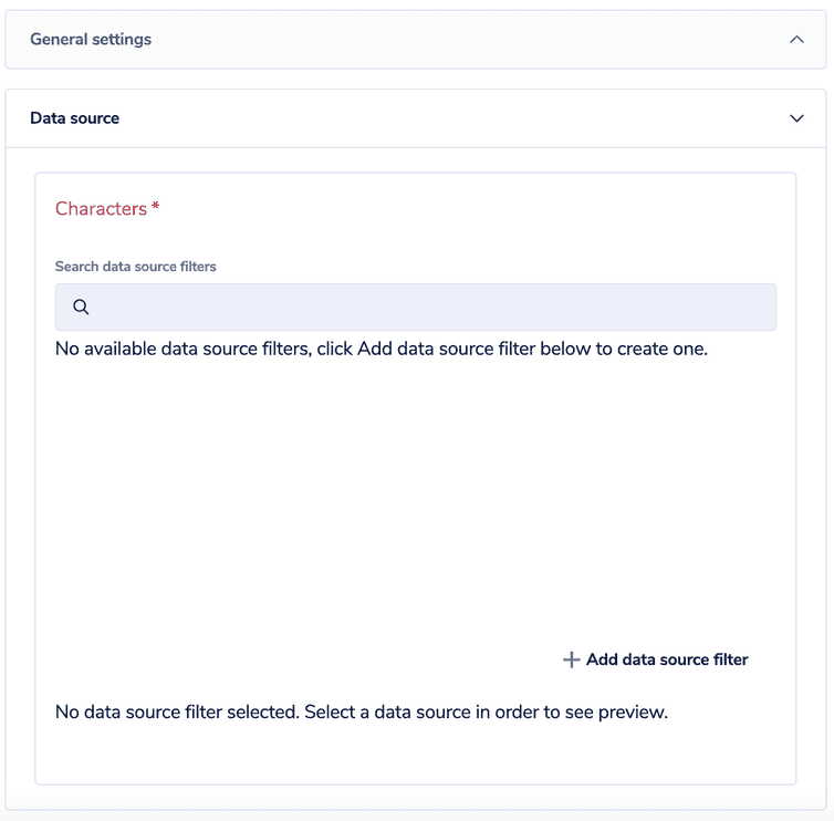
Creating this schema in the Studio and editing it on a page results in the following settings form:
We can now click + Add data source filter to bring the data into the component. See the using the data source filter editor article for how to use the filter editor.
Once you've configured your schema.json for your Frontend component with a dataSourceType, you can then automatically access the data in your index.tsx file in the corresponding field name. You can then deal with that data as you wish, for example, display the data, send the information to another server, and so on.
The API hub then does all the magic to display products to your customers as they navigate your site.
Find out more about schemas and a complete list of field types and their possibilities in schemas.
Component input in code
In the React entry point of your Frontend component, you'll recieve a data prop which contains the entire configuration from the Studio.
import React from 'react';import { useRouter } from 'next/router';import Link from 'next/link';const StarWarsCharacterSearchTastic = ({ data }) => {const { totalCount, pageInfo, people } = data.data.dataSource;const router = useRouter();const { slug, ...queryWithoutSlug } = router.query;return (<div><h1 className="text-2xl mt-8 font-sans">Star Wars Characters</h1><p className="mt-2">{totalCount} total characters found</p>{people.map((character) => (<div key={character.id}><h2 className="text-lg mt-6 font-sans">{character.name}</h2>{character.species !== null && (<p className="mt-2">Species: {character.species.name}</p>)}</div>))}{pageInfo.hasNextPage && (<div className="mt-6"><Linkhref={{pathname: router.asPath.split('?')[0],query: {...queryWithoutSlug,cursor: pageInfo.endCursor,},}}><a className="bg-primary-500 px-4 py-2 text-white">Next Page</a></Link></div>)}</div>);};export default StarWarsCharacterSearchTastic;
The index.tsx defines a type for the data prop derived from the Frontend component schema. In the code, the provided data can then be directly accessed. It's the data.dataSource that takes the configuration from the Studio.
Frontend component schema is only for visualization purposes. The field identifiers in different sections are all global. That means you can freely regroup fields into sections, but also that field identifiers must be unique across all sections!
You can have multiple components on the same page using the same data source. But, data sources don't communicate with each other (unless you configure this yourself), so you could see the same thing in both components.

