This is the early access documentation preview for Custom Views. This documentation might not be in sync with our official documentation.
Change brand and style
After adjusting the structure and content of your storefront, it's time to modify the visual elements such as header, font, and colors, to align with your brand's theme and styling.
Edit the header
The header is a component group, which you can edit from the Templates > Component group area in the Studio.
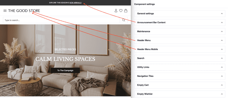
Inside the component group builder, selecting the commercetools UI header component group opens the Component settings pane. The configuration options map to the elements of your website header, as shown in the following image.
To add your brand's logo, expand the Header menu and Header menu mobile sections and replace the current image with your logo.
Be aware that changes to component groups, such as the header, might take up to a few minutes. This is because component groups are used across many pages that need to be updated after a change.
Change the styling
Apart from the header, you will also want to change the font and color theme used across the website to match your branding.
To apply custom font and colors, update the configuration in the Tailwind CSS config file in your commercetools Frontend project at the following path: packages/PROJECT_NAME/frontend/tailwind.config.js.
Edit the theme's font
To change the font, update the fontFamily values for body and heading to the font family that you would like to use, for example Verdana.
Edit the theme's colors
To adjust the colors to match your brand's theme, update the colors object, and all the components using these colors will update automatically. For example, if you change the primary.dark color to darkblue, the announcement bar at the top of your page will change to dark blue.
Edit the color of the commercetools Frontend components
If you notice that after changing the global styles, you still have parts of the storefront that are not styled as you expected, then specific Frontend components might be overwriting the global styles. To fix that, identify the React components and change the local styles for them. You can find the React components in packages/PROJECT_NAME/frontend/components/commercetools-ui/atoms/ .
As an example, to update the colors of the button component, modify packages/PROJECT_NAME/frontend/components/commercetools-ui/atoms/button/useButtonClassNames.ts.
You can now edit the design of the primary button by editing the classes for primaryClassName.
const primaryClassName = useClassNames(['bg-gray-700 text-neutral-100 outline-offset-0','hover:bg-gray-500','active:shadow-button active:disabled:shadow-none active:bg-secondary-black','focus-visible:outline focus-visible:outline-gray-700 border-gray-700 focus-visible:border focus-visible:outline-offset-[3px]','disabled:bg-neutral-400 disabled:text-neutral-100',]);
Exchange the CSS classes used for the various button states to the ones to be used from the global Tailwind CSS definitions.
Thoroughly test your storefront, including hovering and clicking on every button, to make sure you don't miss some styles that need to be adjusted.
